Mastering Flutter Widgets — Part 2: Crafting Textual Masterpieces and Data Flow.

I am a mobile application developer who likes creating user-friendly apps using dart language and flutter framework.
This article is a continuation of the “Mastering Flutter Widgets — Part 1: The Building Blocks of Brilliance” that would help you understand and be fully grounded about widgets. If you know little about widgets or you don't know anything at all about it, kindly check out the part 1 of this article. Lets take a look at what this article is covering.
In this article, we would be covering two major things when working with widgets;
Widget Varieties
Widget Symphony
Widget Varieties:
Flutter boasts a rich ecosystem of widgets, each serving a unique purpose in crafting stunning and interactive UIs. Here's a brief overview of some key categories:
1. Basic Building Blocks:
Text: Display textual content, style it with fonts, colors, and effects.
Image: Showcase visuals, adjust size, and handle interactions like taps.
Container: Group other widgets together, define layout and decoration.
Row & Column: Arrange widgets horizontally or vertically, customize spacing.
2. Advanced and Specialized:
Custom Widgets: Build your own reusable components with specific functionalities.
Navigation Widgets: Manage app navigation, build menus and tabs.
Form Widgets: Create structured forms for user input, validate data, and handle submissions.
Platform-Specific Widgets: Access native platform features and styles for consistent UIs.
3. Dynamic and Data-Driven:
ListView: Display large collections of data efficiently, scroll smoothly through items.
GridView: Showcase data in a grid layout, ideal for images or products.
Provider & InheritedWidget: Manage and share data across different parts of your UI.
AnimatedContainer & AnimatedOpacity: Bring your UI to life with dynamic transitions and animations.
4. Interactive Elements:
Button: Trigger actions on user taps, customize styles and text.
TextField: Capture user input, validate data, and display entered information.
Checkbox & Radio: Allow users to make single or multiple selections.
Switch: Toggle between two states with a tap, perfect for settings or options.
This is just a taste of the vast widget variety in Flutter! Each category holds a multitude of options, allowing you to design and develop UIs that are both functional and visually captivating.

The 'Basic Building Block' category of Widget Variety is easily the most known and used when building. This is because, basically your flutter app can't do without them. From texts to images, down to container and column/row, they are all very important. We would be taking a look at the differences between Container and Column/Row because some developers don't know exactly when to use them and even might not know when to combine it.
| Container | Column/Row |
| Takes exactly just one child widget. | Takes multiple (unlimited) child widgets. |
| Rich alignment and Styling Options. | Alignment but no Styling Options. |
| List of options for the width i.e. flexible width (e.g. child width, available width and you can give it its own width). | Always takes full available height/width. |
| Perfect for custom styling and alignment. | Must use, if widgets sit next to or above each other. |
You can combine both of them together. Wrap a column or row in a container, or use a container in a column or row. Don't see them as alternatives but as crucial building blocks in flutter that can be mixed and match to build really flexible interfaces. Another useful tip when using Column/Row is their positioning.
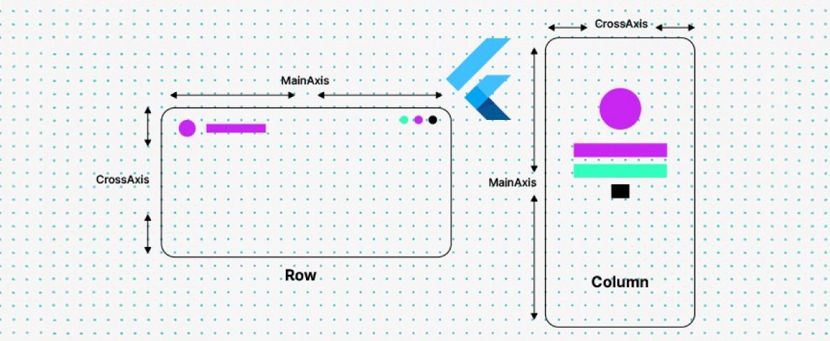
For the row alignment the Main Axis is Left-Right and Cross Axis is Top-Bottom while in the Column alignment the Main Axis is Top-Bottom and Cross Axis is Left-Right. Check out the official flutter documentation https://docs.flutter.dev/ui/layout for more understanding. Another important basic building block is Text, which is used for displaying textual content. In Flutter, texts transcend static displays, evolving into interactive canvases. From styling and animation to user input and data flow, texts become gateways to dynamic and engaging UIs. Text is essential for conveying information, but what truly brings an app to life is the ability to engage in conversations with users. Let's talk about TextInput widgets, the gateways to meaningful interactions.
TextInput Widgets:
Text input widgets are specialized UI elements that enable users to enter text directly into an app. They capture keyboard input, display the entered text, and often provide features for editing, validation, and customization. Think of them as interactive boxes where users can type in information, like their username, a search query, or a message in a chat app. They're essential for building dynamic and user-driven experiences and are your passport to building truly interactive and engaging apps.
Common Examples for Users are:
TextField:
The most basic text input widget.
Customizable with styling, decoration, and input validation.
Allows single-line text entry.
Example: Username or password fields in a login form.
TextFormField:
Designed for use within forms.
Offers additional features like label text, error messages, and integration with form validation.
Example: Email address or phone number fields in a registration form.
TextEditingController:
Not a widget itself, but a controller class used to manage the text value and behavior of TextFields.
Allows programmatic control over text input, such as setting initial text, retrieving entered text, and manipulating the text cursor.
Other Examples:
Search bars
Address forms
Chat messages
Comment boxes
Feedback forms
Key Features:
Text input: Capture and display user-entered text.
Editing: Allow users to modify the entered text.
Styling: Customize appearance with fonts, colors, and borders.
Validation: Enforce specific text formats or content rules.
Hints and labels: Provide guidance for users about expected input.
Importance:
Text input widgets are essential for building interactive and user-driven apps.
They enable direct communication between users and the app, collecting valuable information and enabling personalized experiences.
By effectively using text input widgets, you can create apps that are both functional and engaging for your users.
TextField Widget
This is a special widget in flutter which is an example of the TextInput widget called TextField widget. It is responsible for user receiving input where users can directly communicate with your application. They form the foundation for building interactive and user-driven experiences in Flutter.
Below is a concise overview of the TextField widget in Flutter:
TextField: The Essential Conduit for User Input
Core Purpose: Captures single-line text input from users, enabling them to interact and communicate with your Flutter app.
Key Features:
Displays an editable text field on the screen.
Offers customization options for styling, decoration, and behavior.
Responds to keyboard events, capturing keystrokes.
Stores and manages the entered text value.
Common Use Cases:
Login forms (usernames, passwords)
Registration forms (email addresses, phone numbers)
Search bars for filtering content
Chat interfaces for composing messages
Comment sections for user feedback
Address fields
Note-taking apps
Essential Properties:
controller: A TextEditingController instance to manage the text value and behavior.decoration: Customizes the visual appearance (borders, hints, labels).keyboardType: Specifies the type of keyboard to display (text, numbers, email, etc.).obscureText: Masks entered text for sensitive data like passwords.maxLength: Limits the maximum number of characters allowed.onChanged: A callback function triggered when the text changes.
Relationship to TextEditingController:
TextFields rely on TextEditingController objects to manage their text content and editing behavior.
The controller acts as a bridge between the TextField and your app's logic, allowing you to retrieve, manipulate, and respond to user input.
In your text field, you can pass arguments to text field to configure that. But how can you have access to what the user entered? two ways to do this;
- Simply save the user input with every key stroke i.e. means you save it in a property
import 'package:flutter/material.dart';

class MyTextFieldDemo extends StatefulWidget {
  @override
  _MyTextFieldDemoState createState() => _MyTextFieldDemoState();
}

class _MyTextFieldDemoState extends State<MyTextFieldDemo> {
  // Create a TextEditingController to manage the TextField's text
  final _textController = TextEditingController();

  // Property to store the entered text
  String enteredText = "";

  @override
  void initState() {
    super.initState();

    // Set initial text if needed
    _textController.text = "Initial text";

    // Listen to text changes and update the property
    _textController.addListener(() {
      setState(() {
        enteredText = _textController.text;
      });
    });
  }

  @override
  void dispose() {
    // Dispose of the TextEditingController when the widget is removed
    _textController.dispose();
    super.dispose();
  }

  @override
  Widget build(BuildContext context) {
    return Scaffold(
      appBar: AppBar(
        title: Text("TextField Demo"),
      ),
      body: Column(
        children: [
          TextField(
            controller: _textController,
            decoration: InputDecoration(
              hintText: "Enter some text",
              border: OutlineInputBorder(),
            ),
          ),
          Text("Entered Text: $enteredText"),
        ],
      ),
    );
  }
}
Code Explanation:
Create a TextEditingController:
- This object manages the text value and behavior of the TextField.
Initialize the controller:
- Optionally set initial text using
_textController.text.
- Optionally set initial text using
Add a listener:
- Use
addListenerto listen for text changes.
- Use
Update the property:
- Inside the listener, use
setStateto update theenteredTextproperty with the current text value from the controller.
- Inside the listener, use
Use the controller in TextField:
- Pass the
_textControllerto the TextField'scontrollerproperty.
- Pass the
Display entered text:
- Present the
enteredTextproperty in a Text widget to show the user's input.
- Present the
Dispose of the controller:
- In
dispose, call_textController.dispose()to release resources when the widget is removed.
- In
Key Points:
The TextEditingController acts as a bridge between the TextField and your app's logic.
Using a property to store the entered text allows you to access and use it throughout your app.
Always dispose of controllers when they're no longer needed to avoid memory leaks.
- The second way in doing this is by adding new properties to your class, the input values are always strings by default. Then if you go to your TextField, you can add the onchange listener . This would fire with every key strokes, though setState cannot be called in a stateless widget because you can't update UI based on those changes anyways.
    import 'package:flutter/material.dart';

    class MyTextFieldDemo extends StatefulWidget {
      @override
      _MyTextFieldDemoState createState() => _MyTextFieldDemoState();
    }

    class _MyTextFieldDemoState extends State<MyTextFieldDemo> {
      // Properties to store the entered text values
      String name = "";
      String email = "";
      String message = "";

      @override
      Widget build(BuildContext context) {
        return Scaffold(
          appBar: AppBar(
            title: Text("TextField Demo"),
          ),
          body: Column(
            children: [
              TextField(
                onChanged: (text) => setState(() => name = text),
                decoration: InputDecoration(
                  hintText: "Enter your name",
                  labelText: "Name",
                ),
              ),
              TextField(
                onChanged: (text) => setState(() => email = text),
                decoration: InputDecoration(
                  hintText: "Enter your email",
                  labelText: "Email",
                ),
              ),
              TextField(
                onChanged: (text) => setState(() => message = text),
                decoration: InputDecoration(
                  hintText: "Enter your message",
                  labelText: "Message",
                ),
              ),
              Text("Name: $name"),
              Text("Email: $email"),
              Text("Message: $message"),
            ],
          ),
        );
      }
    }
Code Explanation:
Define properties for input values:
- Create string properties (name, email, message) to store the text entered in each TextField.
Use onChanged callback:
Assign an
onChangedcallback function to each TextField.This function is invoked whenever the text changes in the TextField.
Update properties in setState:
- Inside the
onChangedcallback, usesetStateto update the corresponding property with the new text value.
- Inside the
Display entered text:
- Use Text widgets to display the values of the properties, showing the user's input.
Key Points:
This approach directly stores the entered text within the class properties, eliminating the need for a TextEditingController.
It's well-suited for simpler scenarios where you don't require features like initial text or more complex text manipulation.
Ensure you call
setStateto trigger a rebuild of the widget tree and reflect the updated text values in the UI.An alternative to registering user inputs manually on every key stroke is flutter actually has a built in mechanism that allows you to listen to every key stroke and then get the finish value once you are done. This is done with another example of TextInput Widgets called the TextEditingController. It is a class provided by flutter and you can assign such a controller to your text fields with the help of the controller arguments. Now what do these controllers do? Flutter automatically connects the controller with our text fields and these controllers in the end listens to the user input and saves the user input.
Widget Symphony:
Flutter app development is like composing a symphony, where each widget represents an instrument. To create a captivating melody, you need to carefully arrange the instruments, connect them through communication channels (data flow), and ensure they play in perfect harmony. Sleek right!!
Key Elements of the Widget Symphony:
Harmonious Arrangement:
Organized widget tree: Structure your widgets efficiently using proper nesting and containers to group related elements.
Layout mechanisms: Leverage Row, Column, Stack, and other layout widgets to position and size widgets precisely.
Visual consistency: Apply themes and color palettes to achieve a cohesive aesthetic across your app.
Connected Widgets:
Passing data: Use properties and constructor arguments to pass data between widgets, establishing channels for communication.
State management: Employ tools like setState, Providers, and InheritedWidgets to efficiently manage changing data across the widget tree.
Callbacks and listeners: Leverage callback functions and change listeners to react to user interactions and updates from other widgets, enabling dynamic responses.
Seamless Flow:
Animations and transitions: Add graceful animations and transitions between different UI states to enhance user experience and visual appeal.
Responsiveness: Design your widgets to adapt gracefully to different screen sizes and orientations, ensuring a smooth experience on all devices.
Accessibility: Make your app accessible by considering visual impairments and different interaction methods, allowing everyone to enjoy the symphony.
Code Illustrations:
- Basic Widget Composition:
Row(
  children: [
    Text("Username:"),
    TextField(
      onChanged: (username) => setState(() => _username = username),
    ),
  ],
)
- Data Flow with Providers:
class MyApp extends StatelessWidget {
  @override
  Widget build(BuildContext context) {
    return Provider<String>(
      create: (context) => "Flutter Developer",
      child: MyHomePage(),
    );
  }
}

class MyHomePage extends StatelessWidget {
  final String title;

  const MyHomePage({Key? key, required this.title}) : super(key: key);

  @override
  Widget build(BuildContext context) {
    final title = Provider.of<String>(context);
    return Text("Welcome, $title!");
  }
}
- Animated State Change:
AnimatedContainer(
  duration: Duration(milliseconds: 500),
  color: _isSelected ? Colors.green : Colors.grey,
  child: Text("Click Me!"),
)
Connecting and Managing Data:
There are common techniques to connect widgets in Flutter, enabling them to communicate and exchange data to create interactive and dynamic UIs. Here are a few:
1. Passing Data through Properties and Constructor Arguments:
Properties: Use properties to pass data from parent widgets to child widgets during widget creation.
  class ParentWidget extends StatelessWidget {
    final String message = "Hello from Parent!";

    @override
    Widget build(BuildContext context) {
      return ChildWidget(message: message);
    }
  }

  class ChildWidget extends StatelessWidget {
    final String message;

    const ChildWidget({Key? key, required this.message}) : super(key: key);

    @override
    Widget build(BuildContext context) {
      return Text(message);
    }
  }
2. Using State Management Solutions:
setState: Manage state within a Stateful widget and trigger UI updates using
setState.Provider (InheritedWidget): Share data across different widgets in the widget tree without explicit widget-to-widget passing.
BLoC, MobX, Riverpod: Explore more advanced state management patterns for complex applications.
3. Employing Callbacks and Listeners:
Callback Functions: Pass functions as arguments to child widgets, allowing them to notify the parent of changes or events.
  ElevatedButton(
    onPressed: () => _handleButtonPress(),
    child: Text("Click"),
  )
Change Listeners: Attach listeners to objects like TextEditingController to react to changes in their values.
4. Navigation and Routing:
- Navigator: Manage navigation between different screens (widgets) in your app, passing data between them if needed.
Key Considerations:
Choose the appropriate technique: Select the method that best suits the complexity of your data sharing and the relationship between the widgets.
Consider state management: For complex data flows or shared states across multiple widgets, state management solutions like Provider or BLoC can simplify data sharing and maintainability.
Ensure clarity and organization: Maintain a clear structure and hierarchy in your widget tree to ensure efficient communication and avoid unintended side effects.

With that, we have come to the end of this article. Most importantly, the only way you can learn Flutter is by building apps. You can build apps for yourself, your friends, your family, or even for your clients and also build apps for the Flutter Community. I hope you enjoyed this article!


